UX DESIGN
Online Learning Platform
Youtube Learning
What are the motives in online learning and how can we provide the best learning experience? Youtube Learning was a side project with Stella Lee, a UX/UI designer, and its goal was to create more impactful learning experience for anyone who wishes to learn.
First, we compared 6 different online learning platforms to assess their strengths and weaknesses and discover Youtube Learning’s opportunity in the market.
Strength:
- Variety of topics
- Credibility of instructors
- Option to get certification
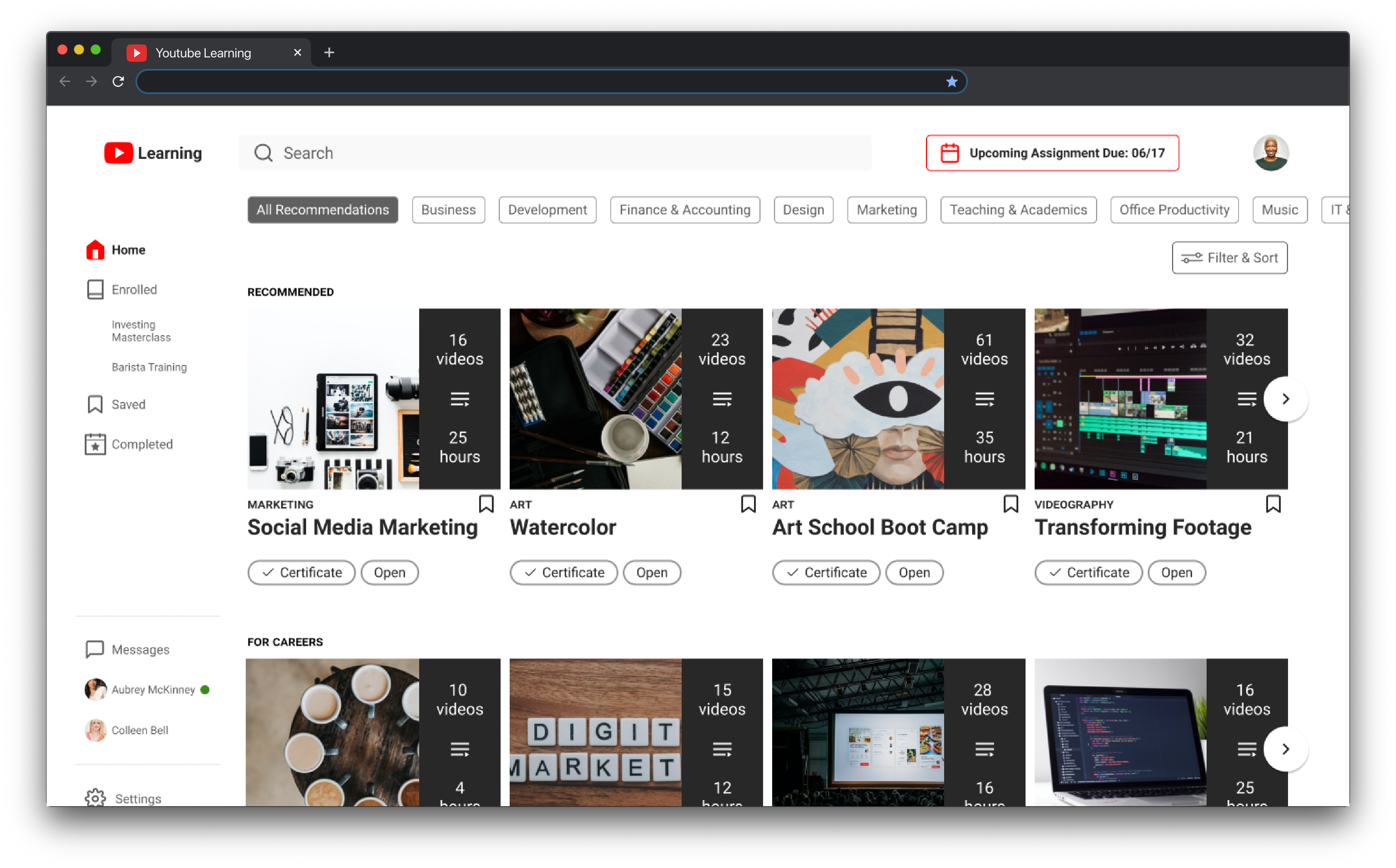
- Courses recommendation
Weakness:
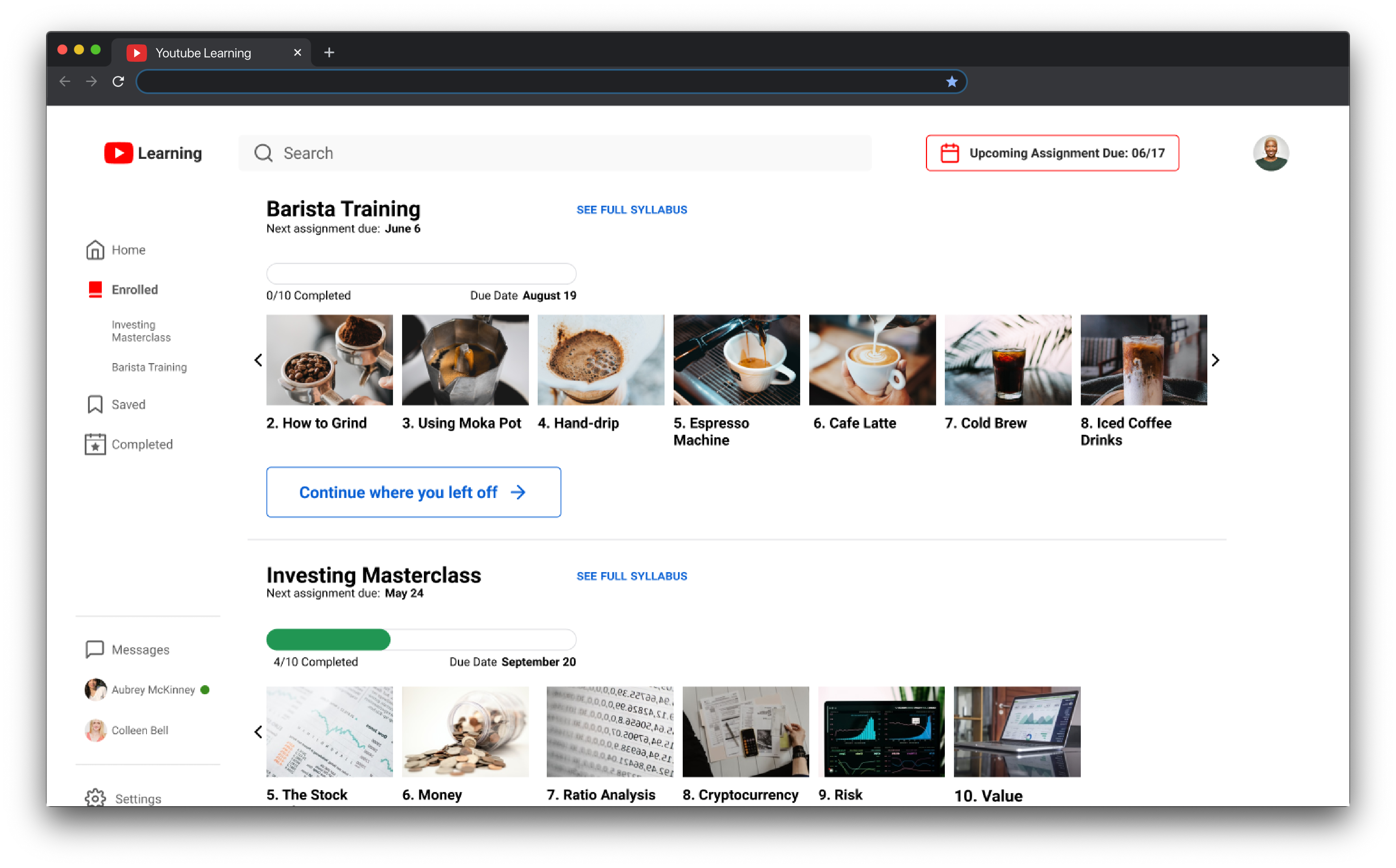
- Lack of flexibility of enrollment and completion
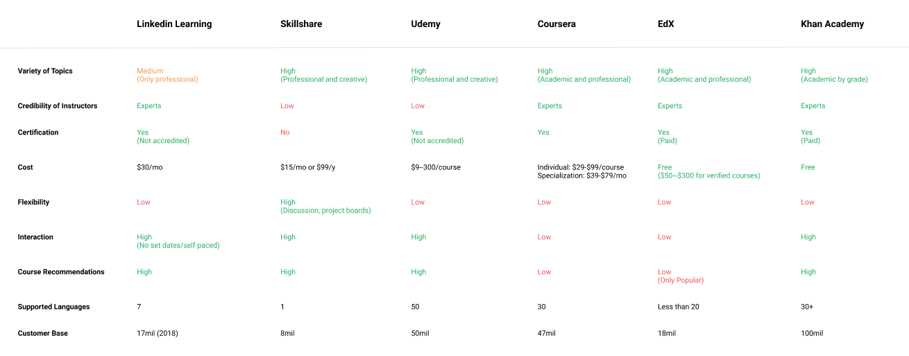
Second, we assessed the current Youtube platform as well, since a portion of its content is educational. Youtube has a huge customer base and range of topics that is larger and wider than any other learning platforms.
If we offer a wide range of topics like current Youtube, offer flexibility that competitors don’t have, and utilize a huge customer base, it will make Youtube Learning competitive in the market and also carry on Youtube’s mission of the democratization of knowledge of the world.
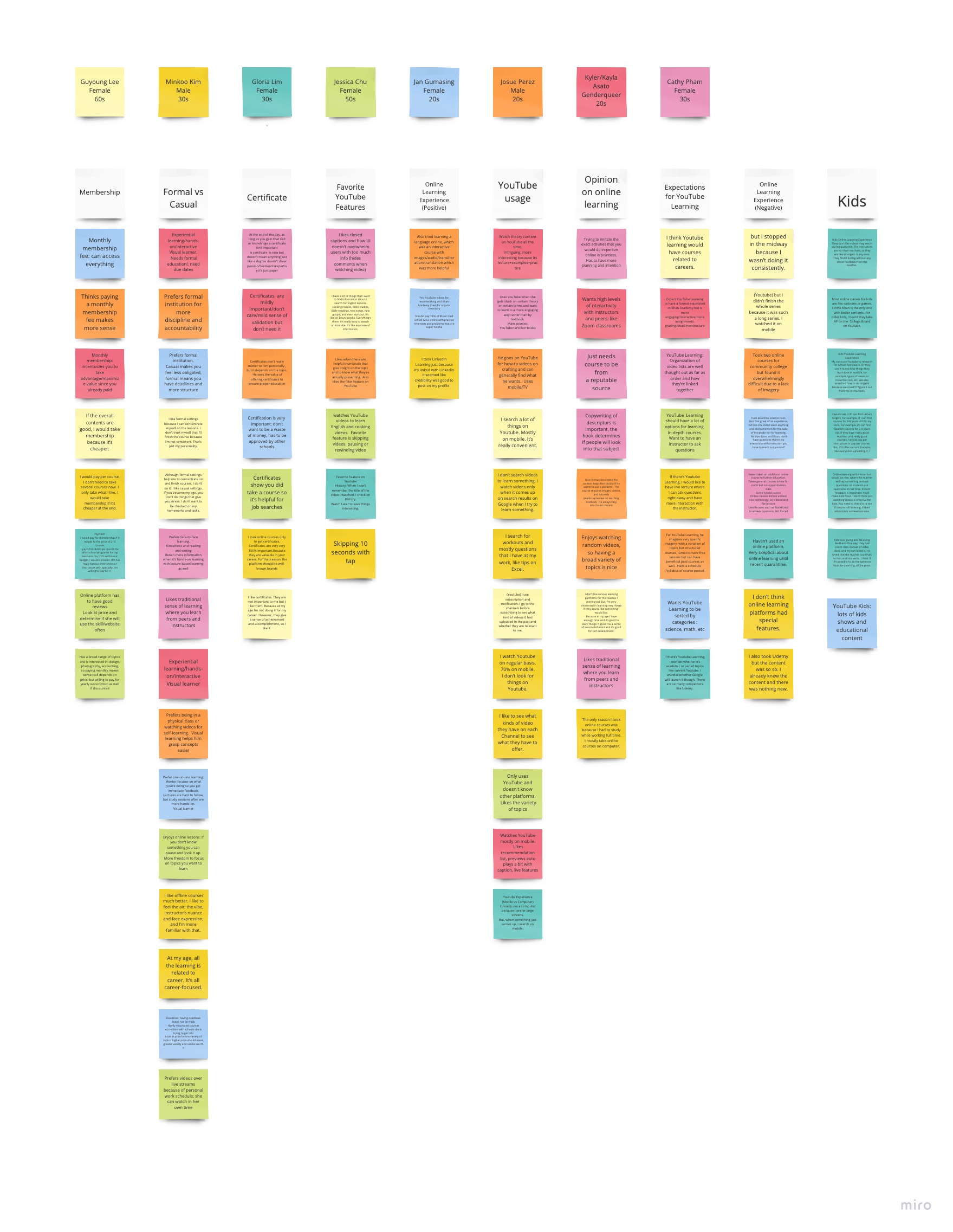
We researched 6 people in the 20s, 30s, and 60s, focusing on their online learning experience, habits, preference, and expectations. Although it was challenging to group their answers because they all varied, we found that their motives fall into either one of the following groups. The other common things was they needed some kind of motivation to finish the course.
- Personal Development
- Career Growth
Affinity Map
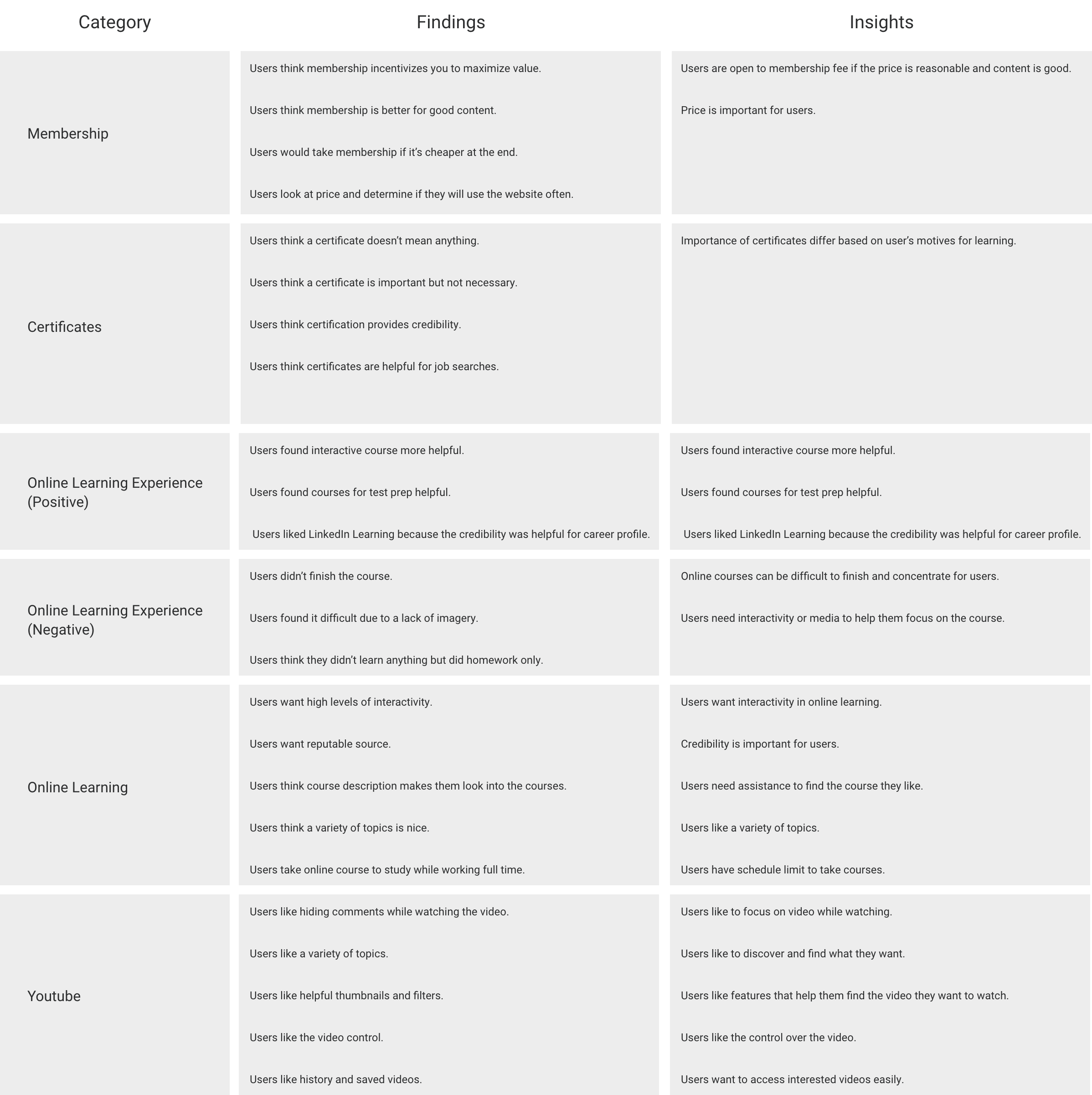
Findings & Insights
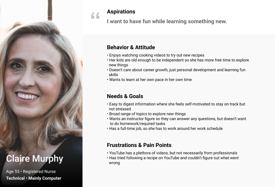
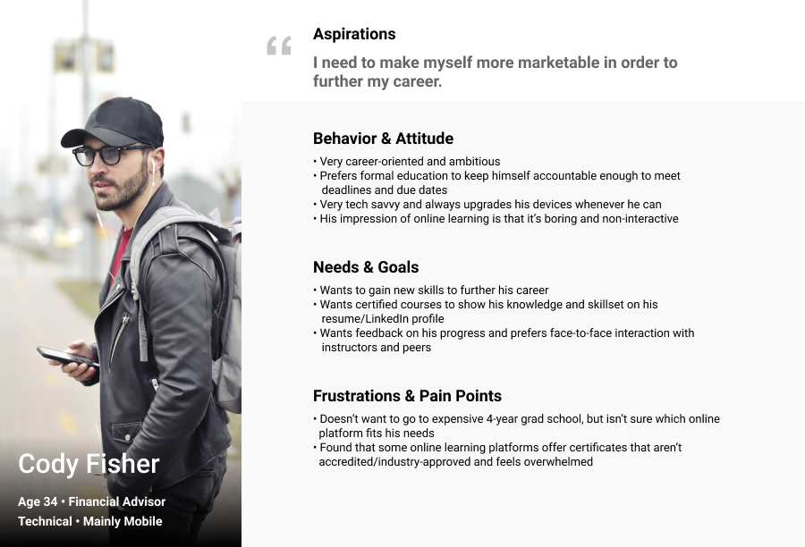
We created two User Personas, Claire and Cody, who will use Youtube Learning for personal development and career growth respectively. Their user journey and flow were the foundation for our wireframes. For Claire, it is important to explore the courses and quickly find out whether the course suits her interest. On the other hand, Cody wants to see the courses related to his career and to get certificates after the completion.
Wireframes
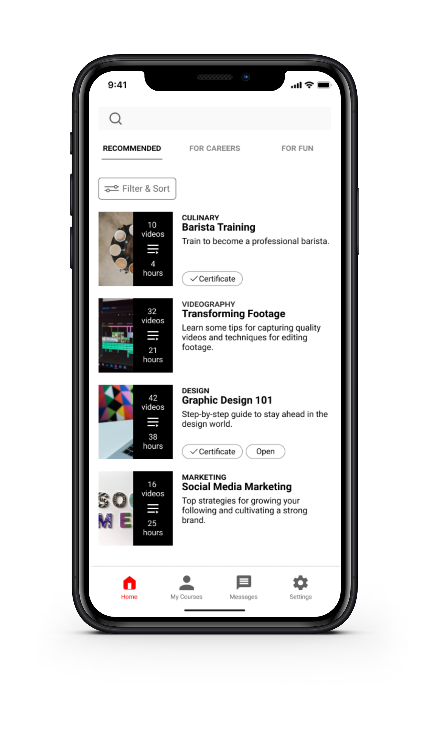
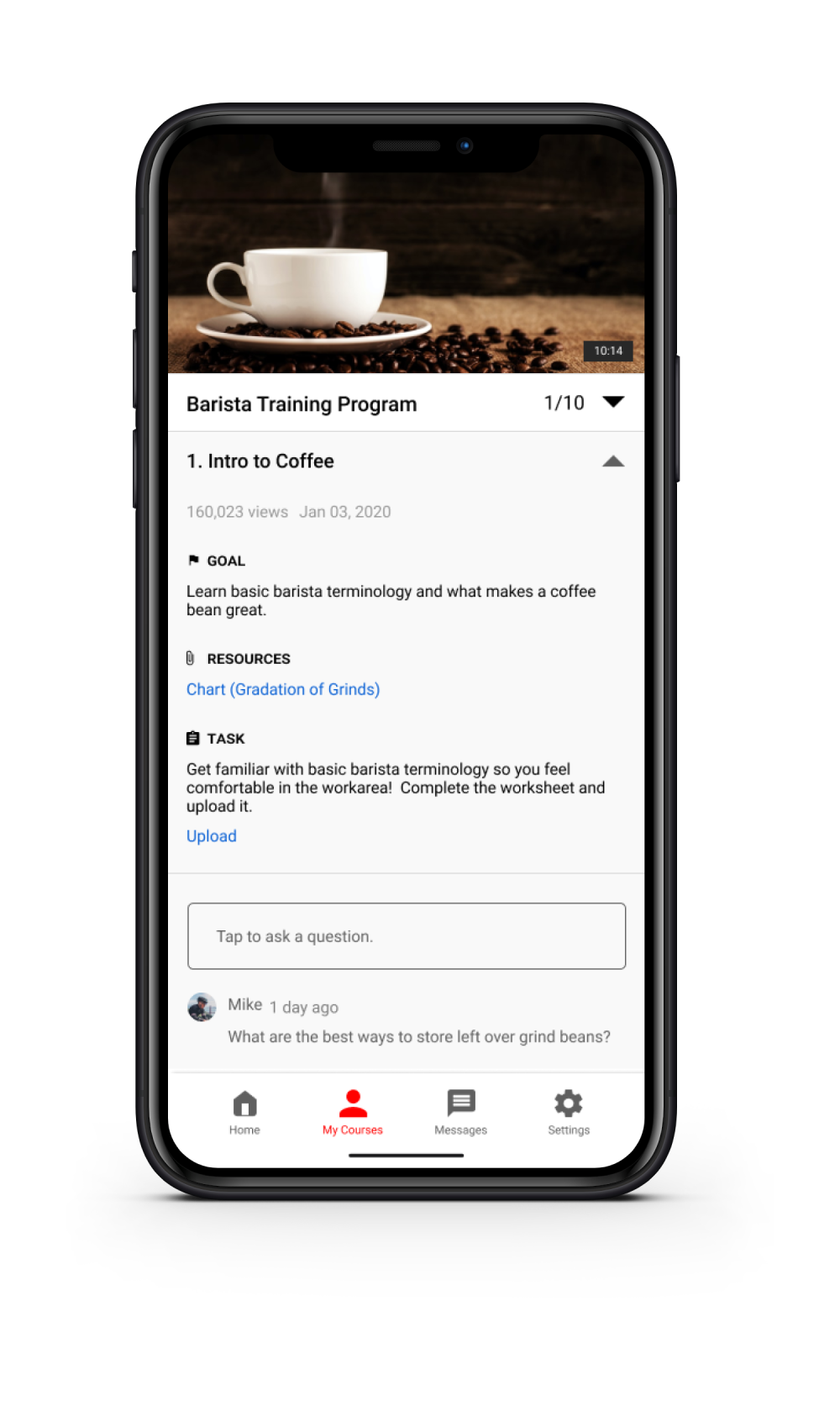
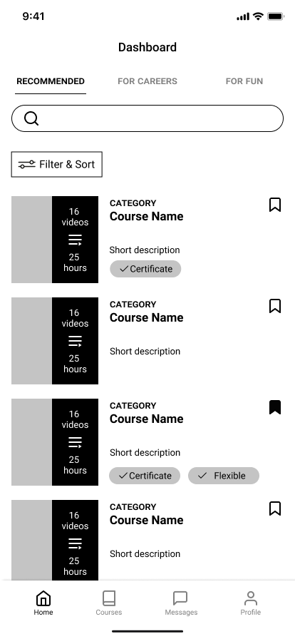
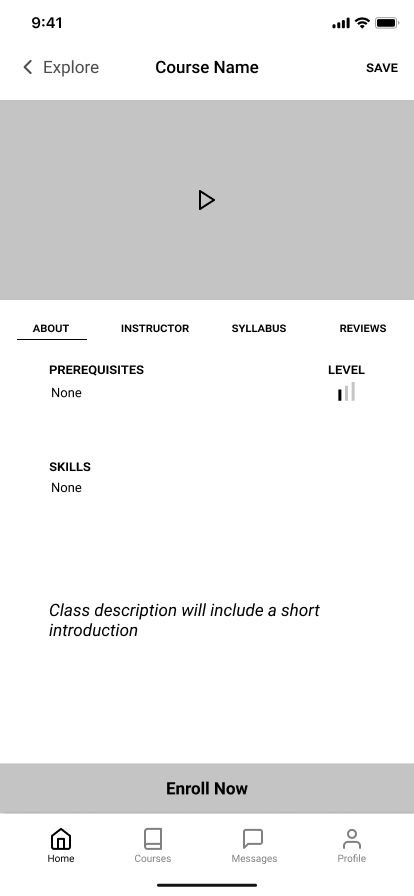
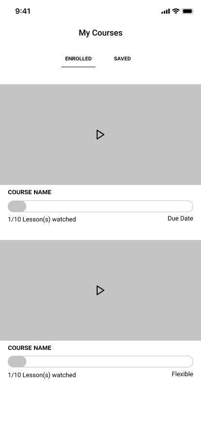
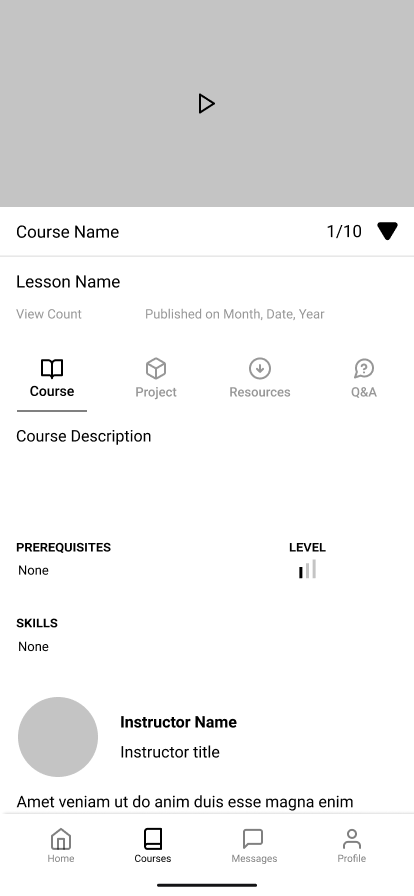
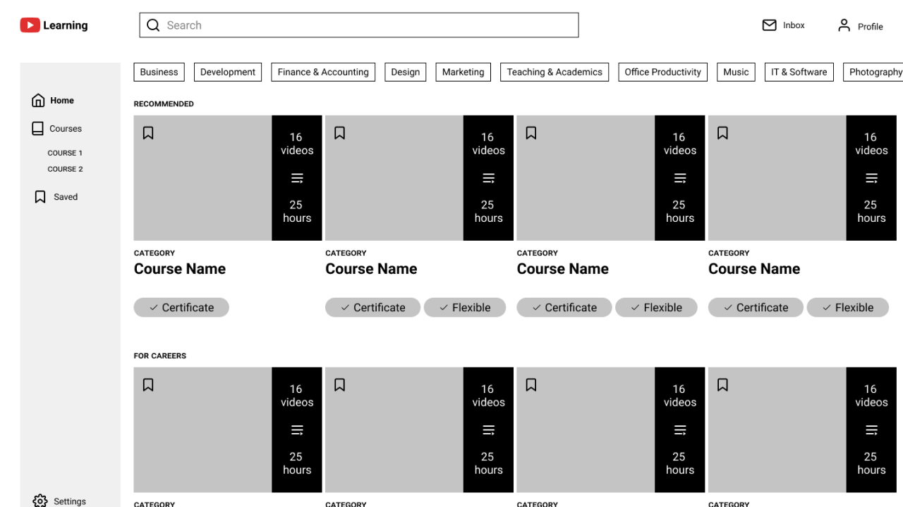
We started out with designing a mobile version to create a Minimum Viable Product. This way we could focus on essential features first such as Filter, Course Description, Enrollment, and Messages.
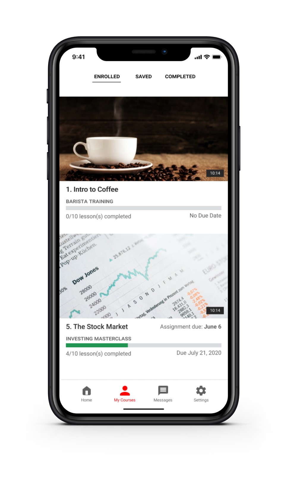
Out of 4 sections of the main navigation, I focused on designing Course and Profile, while Stella focused on Home and Messages. My main goal for the current course screen was to encourage users to continue the course and engage in class activities.
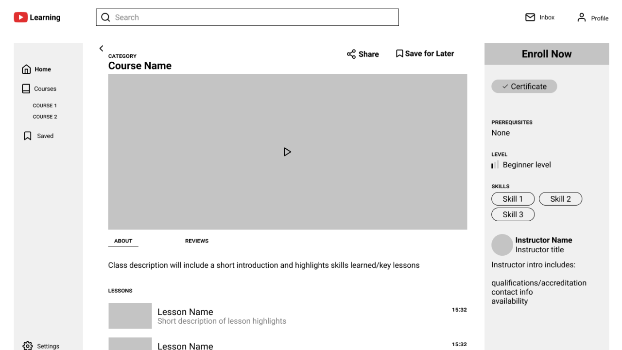
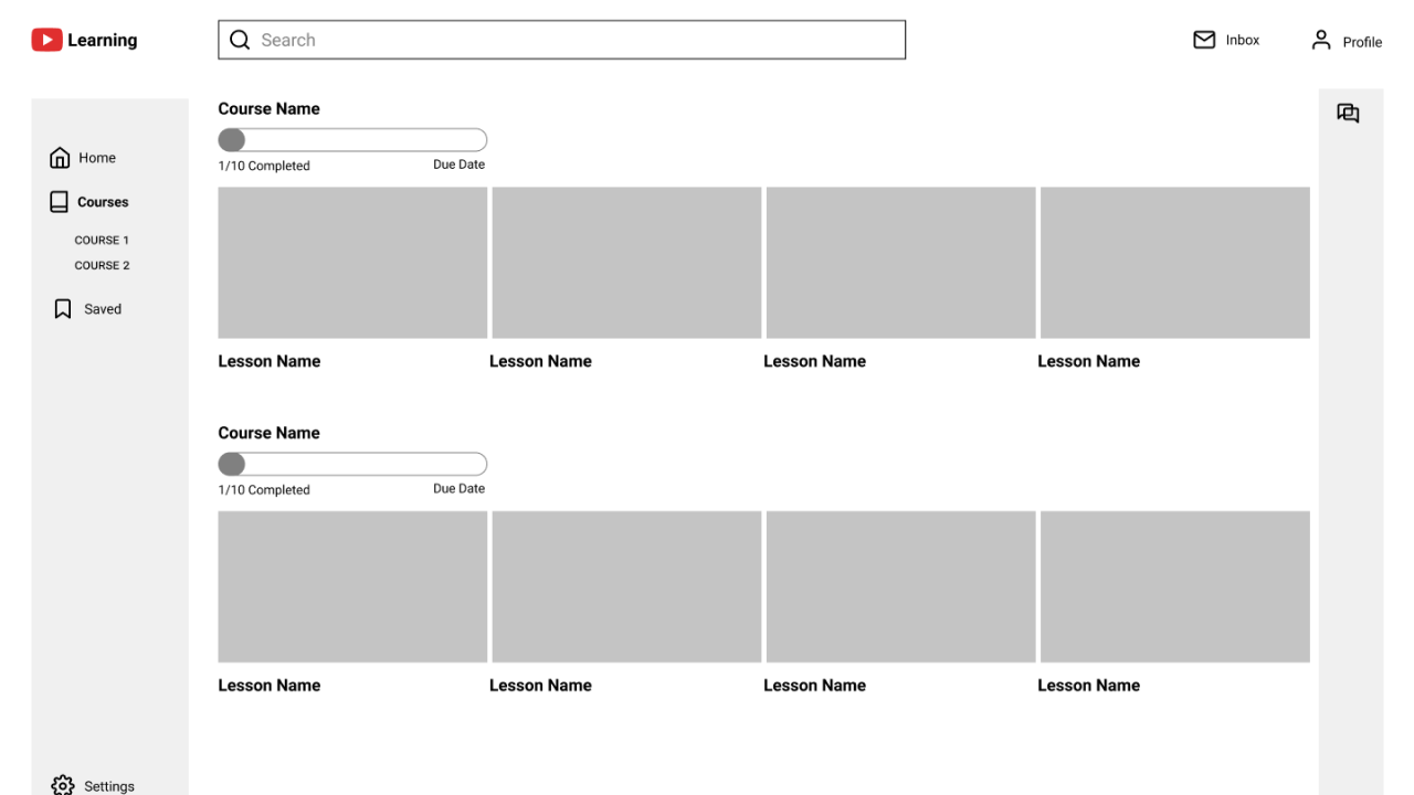
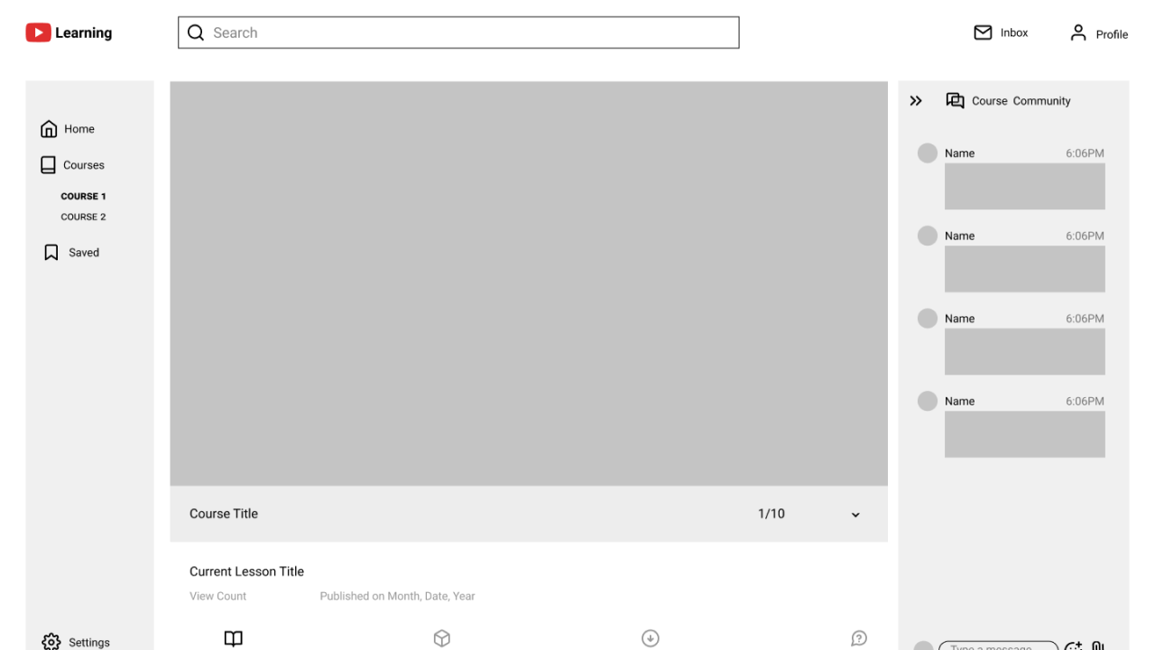
We divided 6 people into two groups, and tested one group on mobile app experience, and the other on desktop website experience.
Goal:
- To measure the learnability and intuitiveness of navigating the application for first-time users
- To determine if users need onboarding and if so, which features
- To get general feedback on the usability, design, and structure of the application
Test Objectives:
- Sign In/Creating an Account: To determine if the process is smooth and users can easily sign in or create a new account
- Exploring and browsing the site: To determine if navigation is intuitive and users can easily find what they are looking for
- Enrolling in a course: To determine if users have sufficient information for each course to make a decision on enrollment
- Completing a course: To determine if navigation in between lessons is intuitive
- Communication: To determine if users can easily participate in class discussions, message instructors, and connect with friends/study buddies
Key takeaways:
- Some terms were misleading or confusing.
- Having message, forum, and chat in one place in the mobile version was confusing for users.
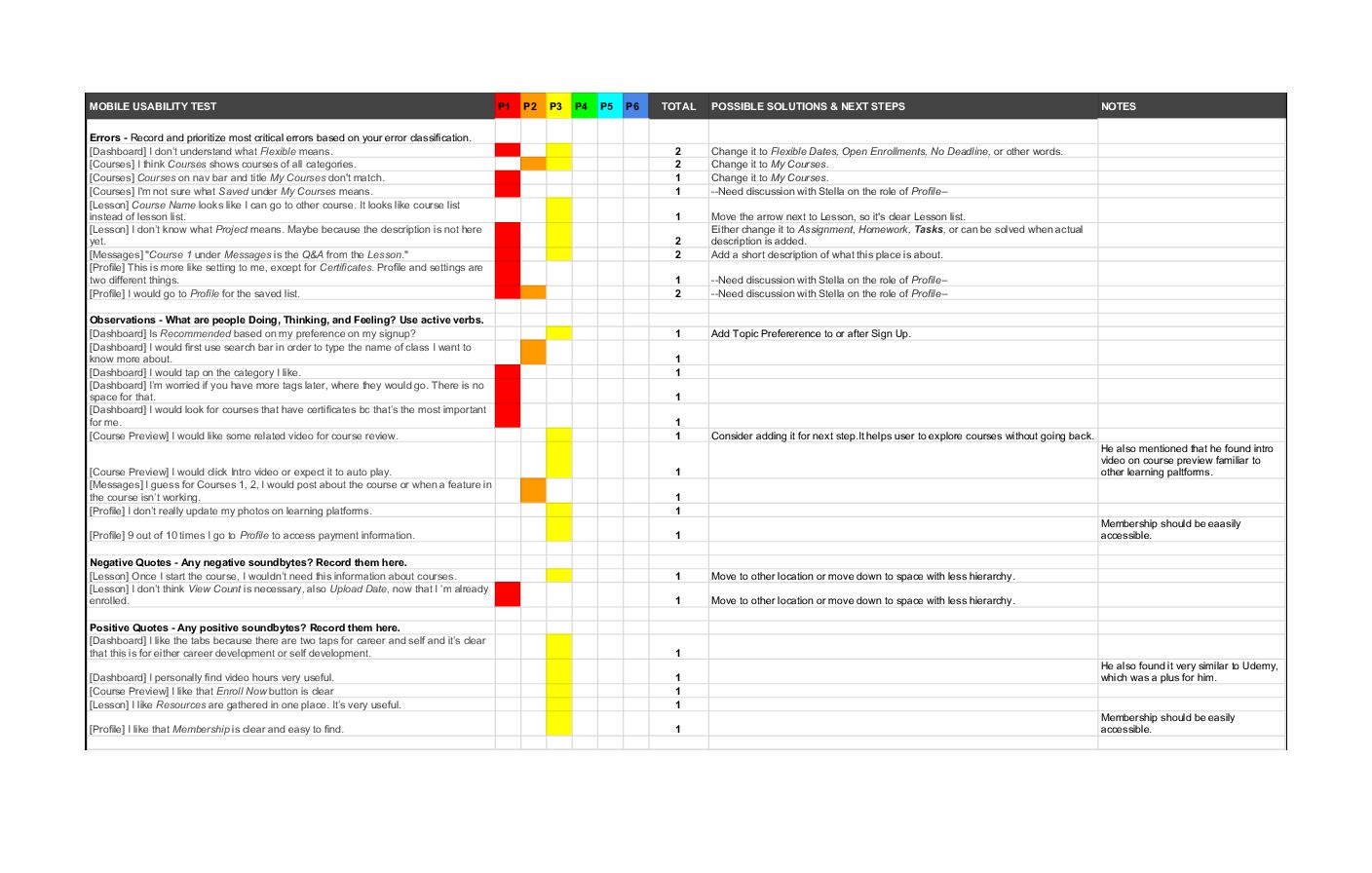
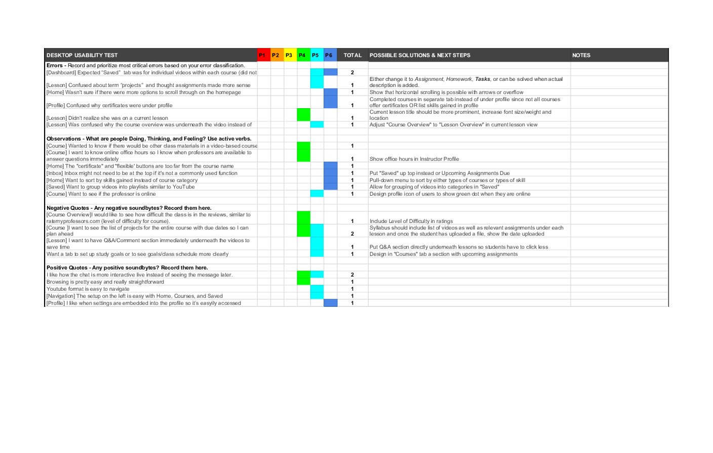
Key Changes:
- Changed misleading terms
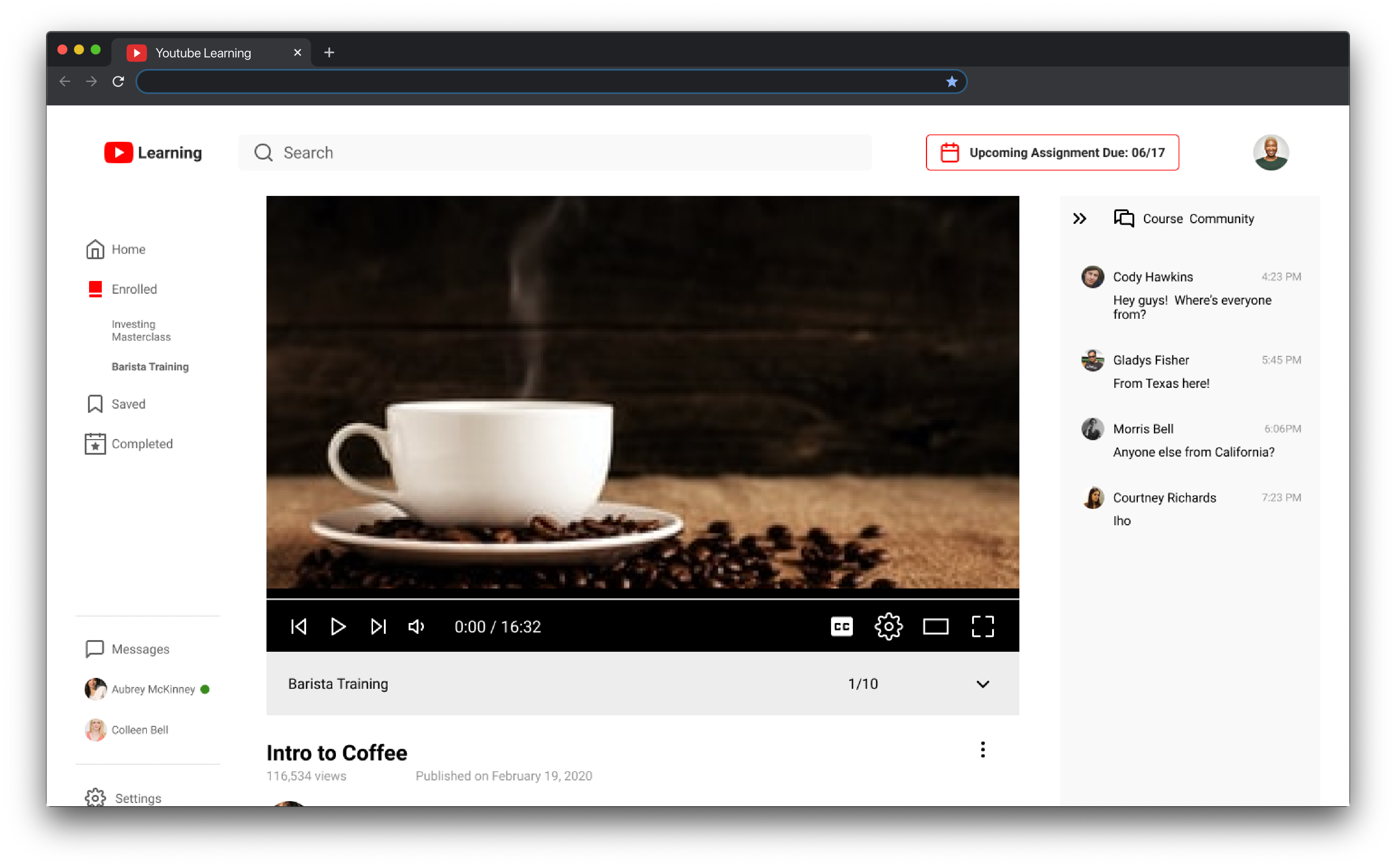
- Simplified mobile version by removing community forum and using toggle instead of tabs of current lesson
- Added indicators such as online status sign in messages
- Used Material Design Icons to match Youtube’s current look
- Changed order of icons in tab bar for quick access to current course
Based on the testing results, we re-organized the content, modified the design, and changed the order of onboarding screens. From this point, I focused on revising the mobile version, and Stella on the desktop version. We’ve already worked together on both wireframes for mid-fidelity and discussed testing results, so we were aware of what changes were necessary for each version. We also shared critics and ideas for newly added screens.
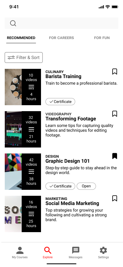
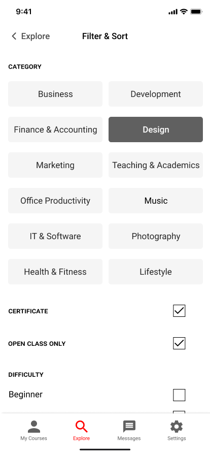
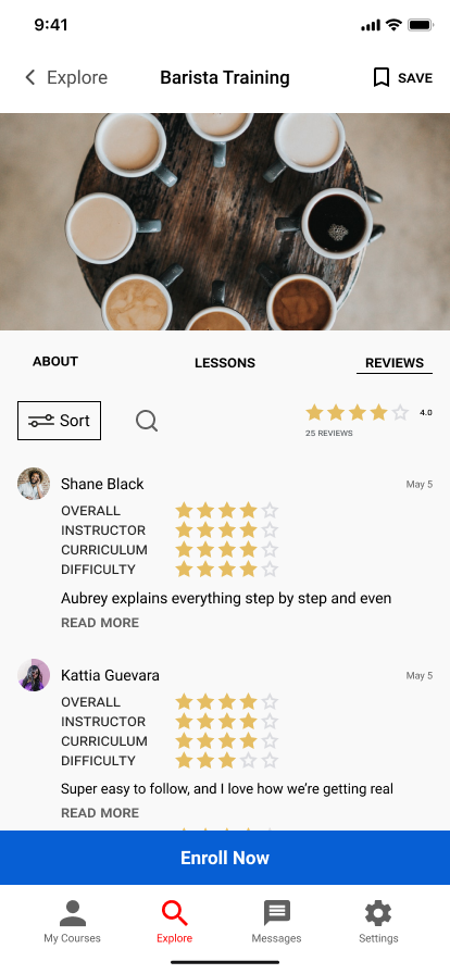
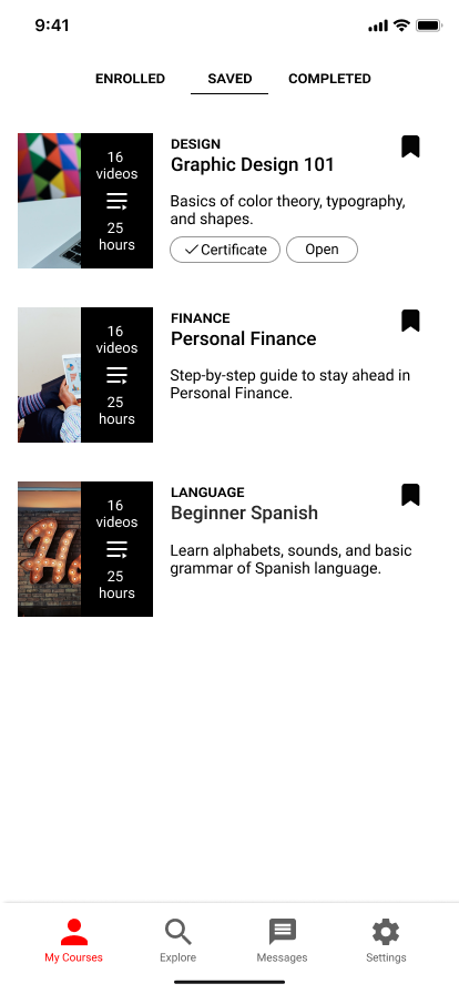
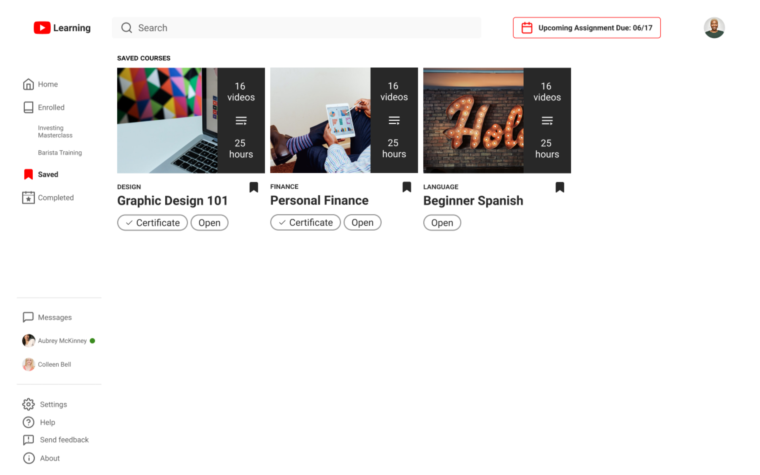
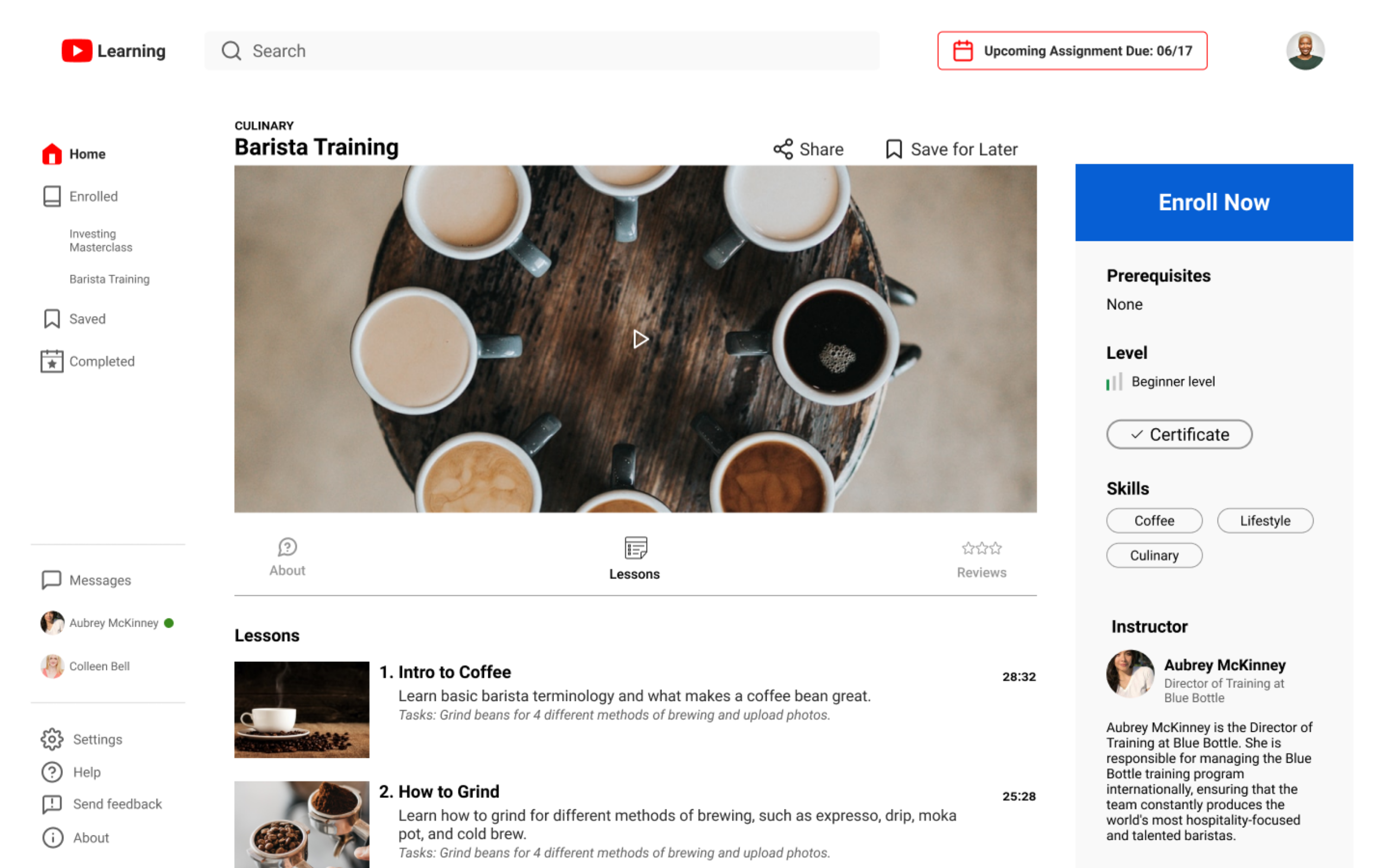
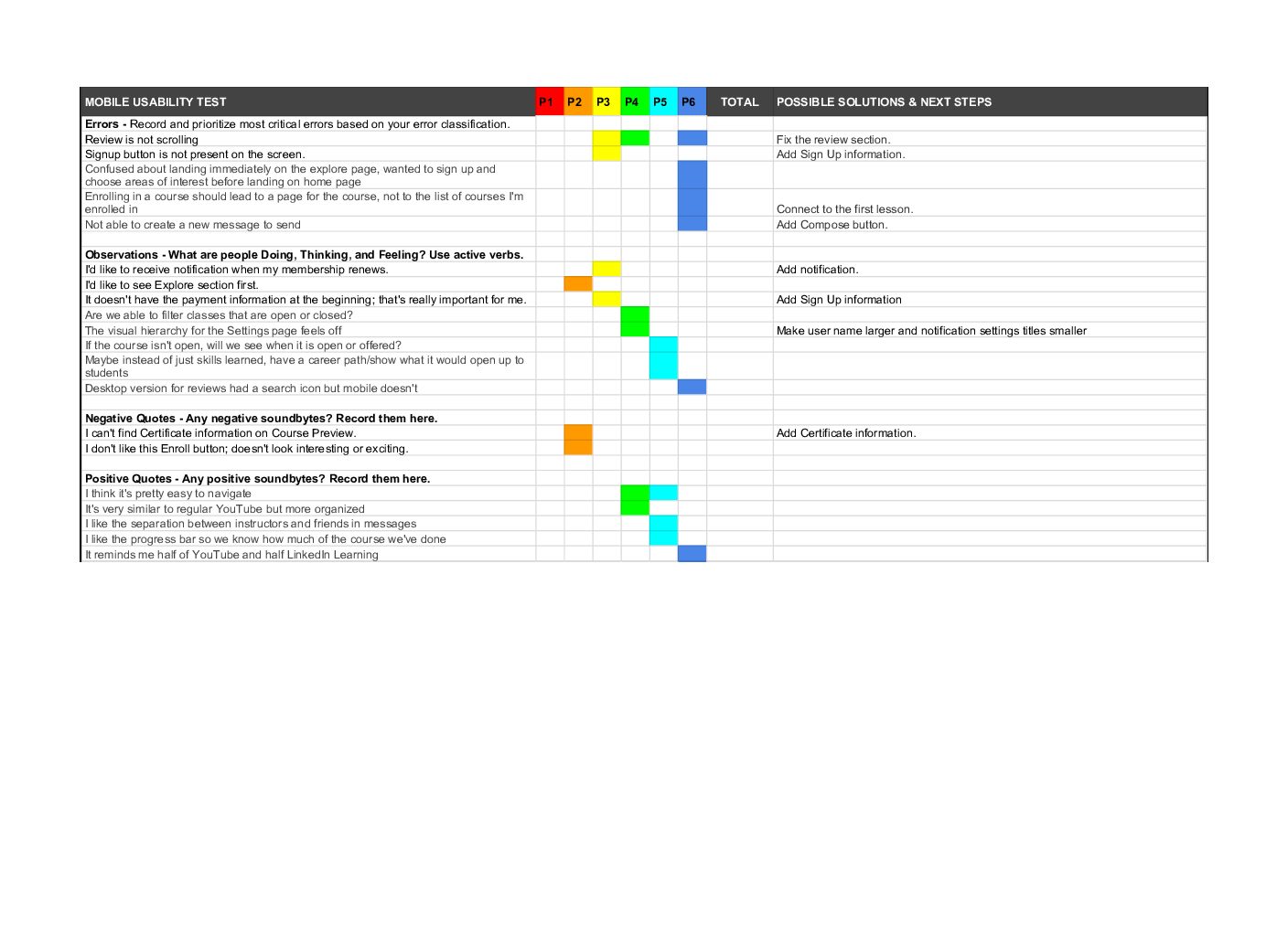
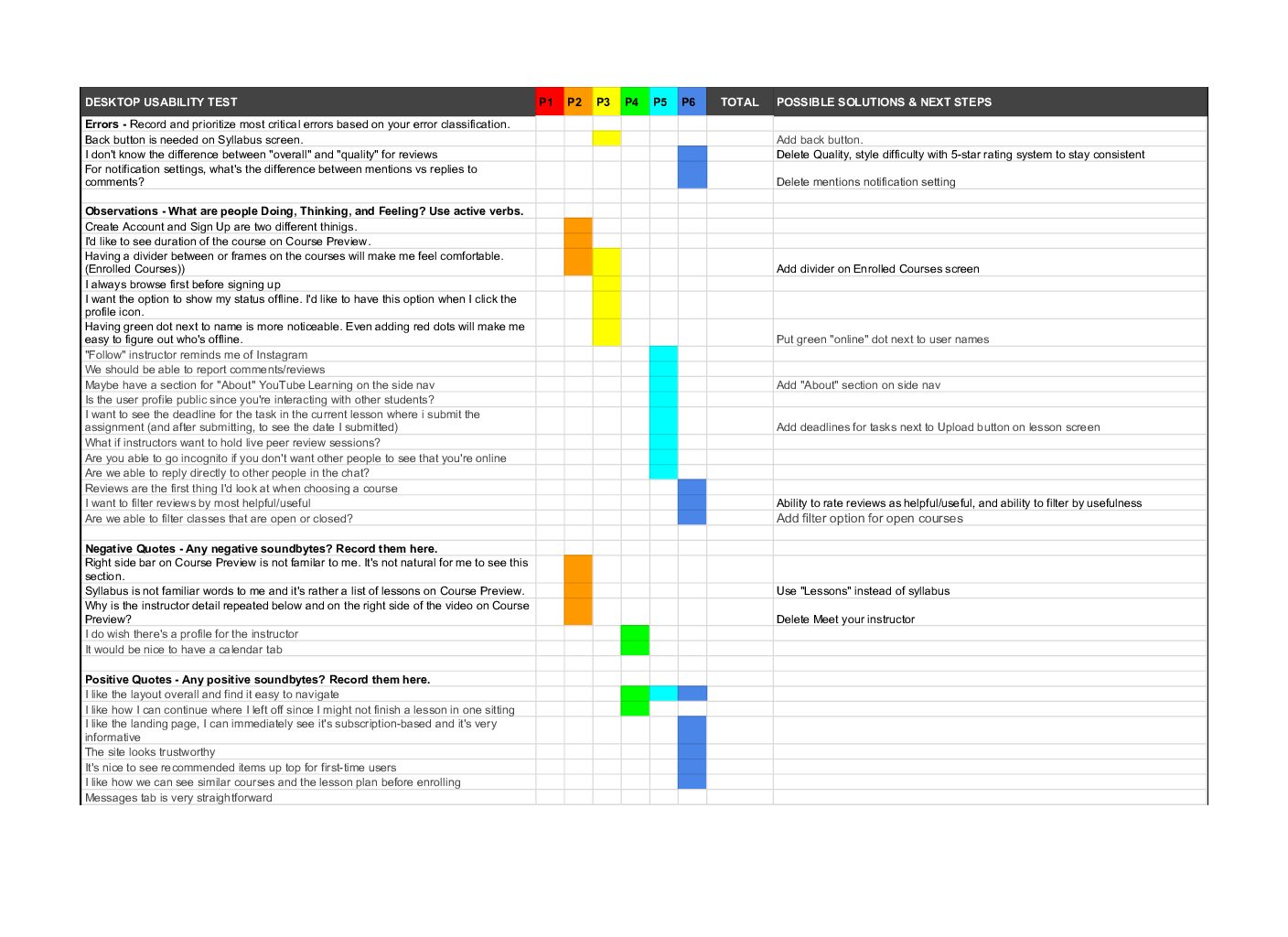
This time, we had all 6 people test both the mobile app and desktop website. Errors from User Testing #1 were solved, however we could further improve the platform based on testing results by changing terms, adding a divider, and shifting the position of elements.
Retrospective
By collaborating with other designer, Stella, I could explore more design choices compared to when working alone. What helped this remote collaboration was the constant discussion from setting project timelines and to making design decisions, and moving forward with the decision. Sharing honest feedback and updating weekly goals were another key to the successful collaboration.
For collaborative design, we took advantage of Figma’s real-time collaborative editing and quickly created wireframes. However, I spent more time on creating prototypes, so I reviewed tutorials to improve my skills.
For the next round of design, I’d like to conduct in-depth user research on the topic of interaction on online learning platforms, which was another high-demand from the user research and create more interaction-focused features.

