UX DESIGN

Surf Forecast App

Vela

How do you provide various weather data in an easy way for surfers to understand in order to choose the best day and time to go to beach?

Vela was a project from CareerFoundry to practice User-centered design and the iterative process of User Experience Design. The goal was to create an easy-to-understand and beautifully displayed forecast app for water sports.

Initial Problem Statement

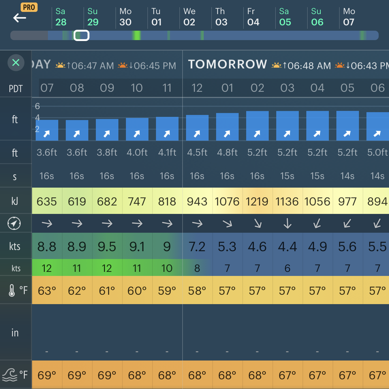
Surf forecast apps provide various weathe information that are vital for the safety of surfers and the quality of surfing activity. However, they are complicated for new surfers to understand. Our surfers need a way to easily interpret the forecast because they want to prepare for a fun and safe experience in the water.

Process

After researching current competitors on the market and surfer’s pain point in using those apps, I created user personas to define the target user. Then I proceeded with the iterative process of designing and testing to deliver the final solution for the first version of Vela.

Discover

Competitive Analysis
User Research

Define

User Personas
Journey Map
User Flow

Develop

Wireframes
Prototype

Test

User Testing
Preference Test
Redesign

UNDERSTANDING THE MARKET
Competitive Analysis

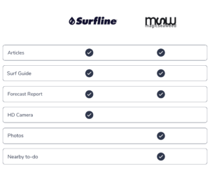
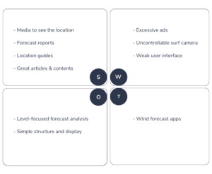
First, I assessed 5 weather apps for water sports and analyzed their marketing strategy, SWOT profile, and UX. I narrowed down the competitor list and focused on Surfline and Magicseaweed, two apps targeting the same audience as our target market. Below are the comparison table and SWOT profile that explore their benefits and current surf forecast market.

View full version of Competitive Analysis.
Strategy: Our competitors already have a strong target market of surfers, but Vela will be competitive if we focus on beginner-intermediate levels and combine Surfline's friendly analysis and Magicseaweed's clean interface.
View full version of Business Requirement Document.

BUILDING EMPATHY
User Research

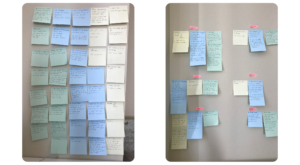
Now, it’s time to get to know our users and their goals and needs in surfing activity. I interviewed three people regarding their experience with surfing activity and surf forecast apps. 

Affinity Map

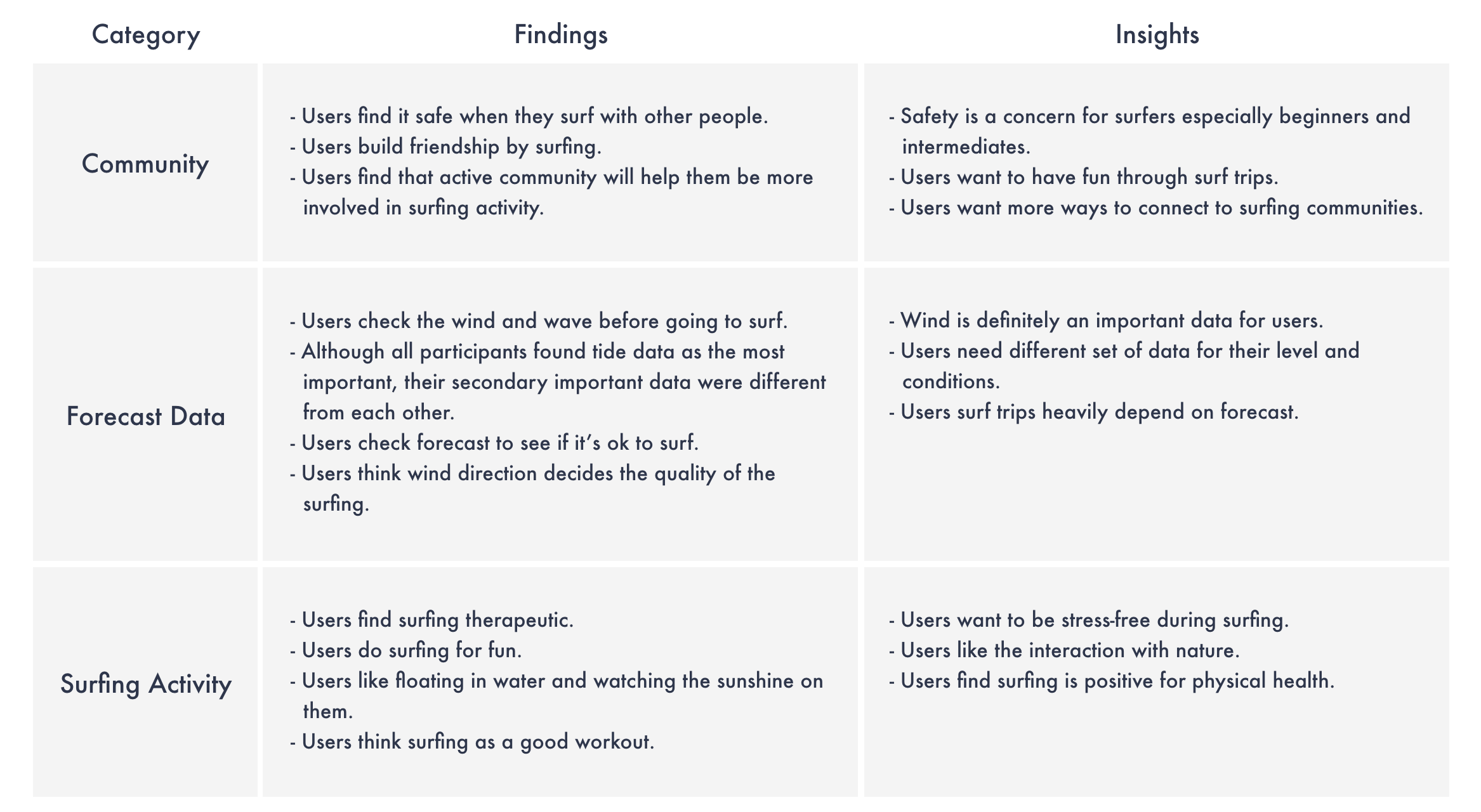
Findings & Insights

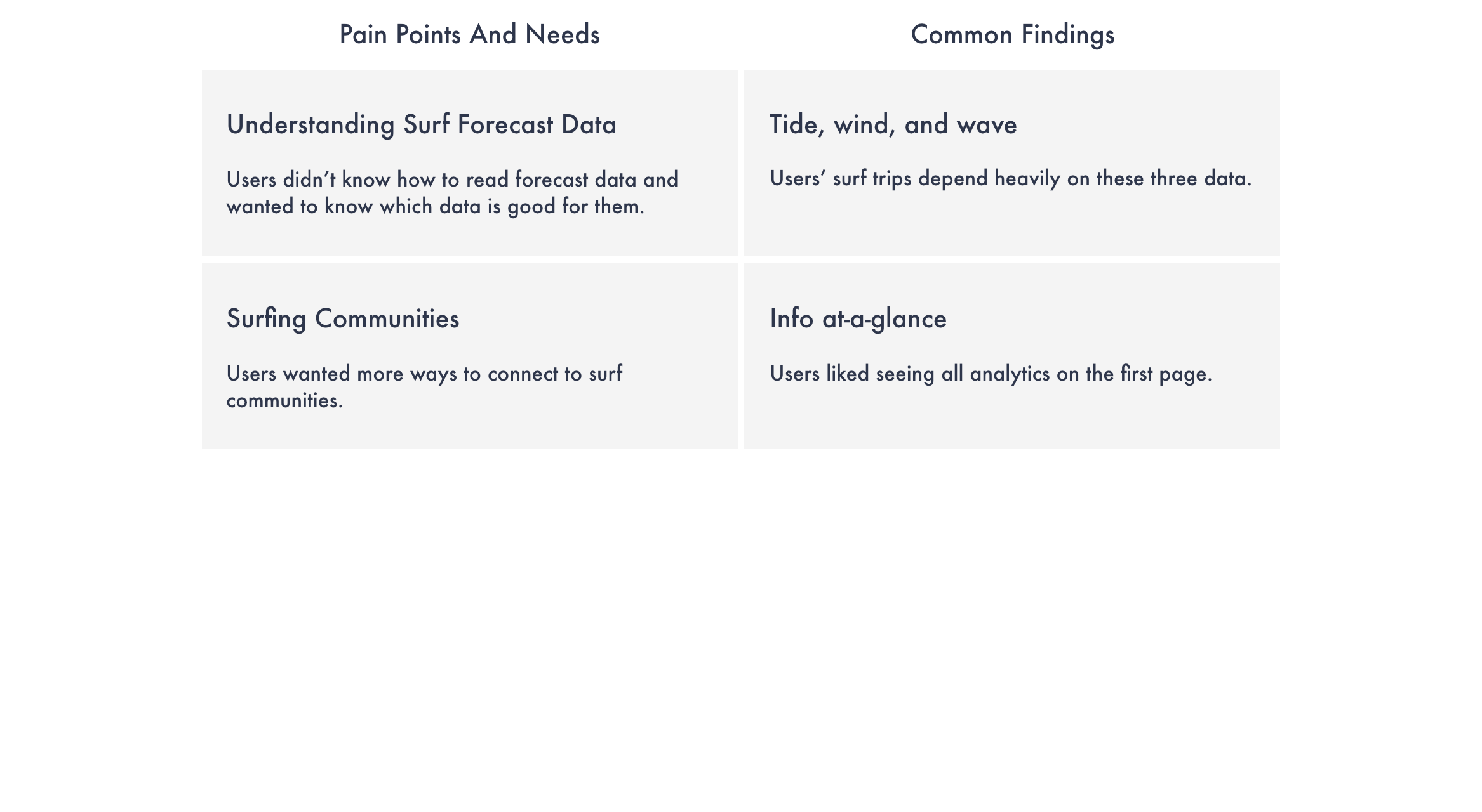
Pain Points & Needs

Updated Problem Statement: Our surfers need a way to easily understand surf forecasts and to connect to the surf community because they want to have a safe and fun experience in the water.

THINKING LIKE USERS
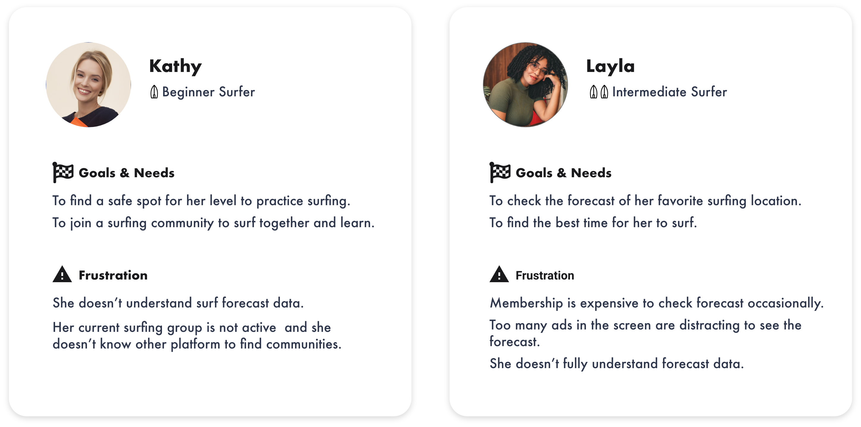
User Personas

Based on user research analysis, I created two user personas with slightly different backgrounds, goals and frustrations, but same pain points and needs from the user research results. These are the people I am designing Vela for.

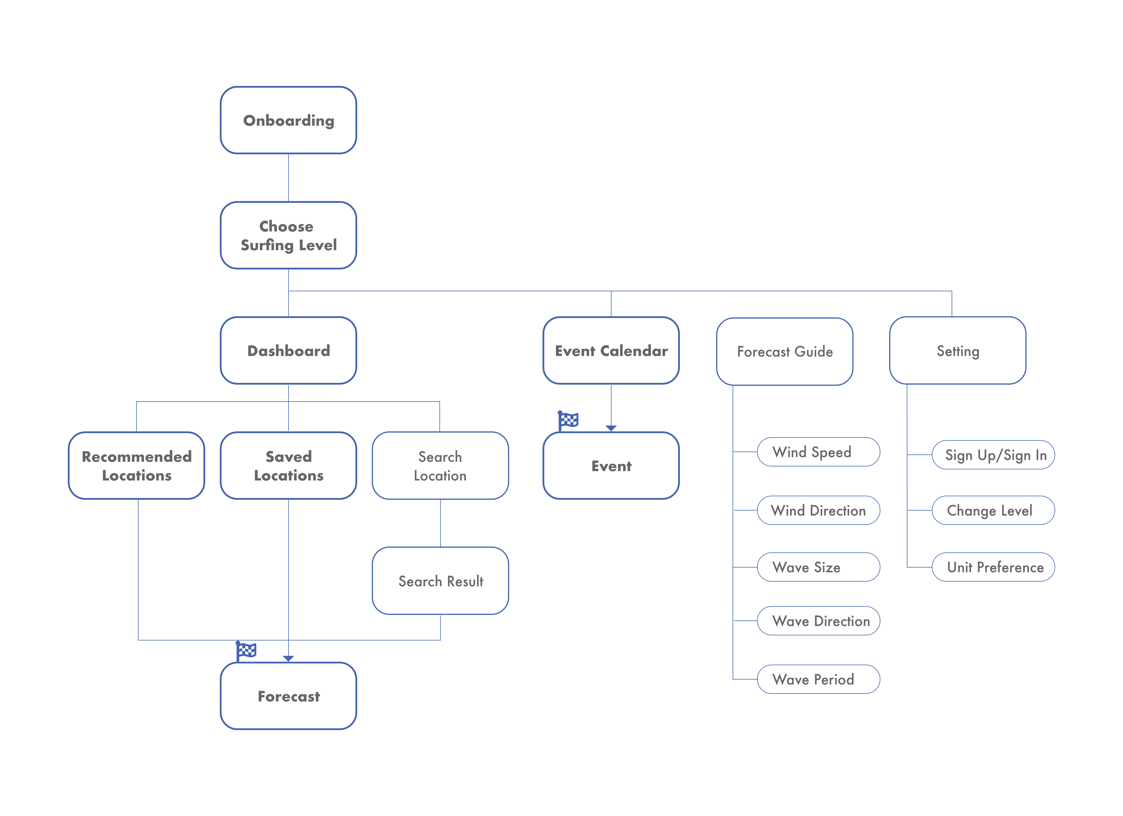
View full version of User Persona, Journey Map, and User Flow.

ORGANIZING INFORMATION
Information Architecture

View Card Sorting results.

POSSIBLE SOLUTIONS
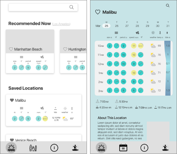
Wireframes

  1. I placed the core features of Vela–Search, Save, Forecast Data, and Save–on low-fidelity wireframes.
  2. After testing whether users can complete the tasks on the low-fidelity wireframes, I developed the different versions of forecast data display on mid-fidelity wireframes.
  3. Usability testing and preference test was performed to see which option helped users find and understand the data most easily. I added photos and colors to finalize the design on high-fidelity wireframes.

Low-fidelity

Mid-fidelity

High-fidelity

VALIDATING THE APPROACH
User Testing & Preference Test

User testing was conducted to see if Vela solves the problem we found at the earlier stage. The main goal of the testing was to see whether users can find the forecast data they are looking for and interpret them.

Main problems discovered:
  • The meaning of the instructional graphics on the onboarding is not clear.
  • The data does not calculate variables.
Solutions:
  • I added text and made the preview graphic exactly the same as the actual screen.
  • I added text for variables.
View Usability and Preference Test Reports.

INCLUSIVE DESIGN
Accessibility

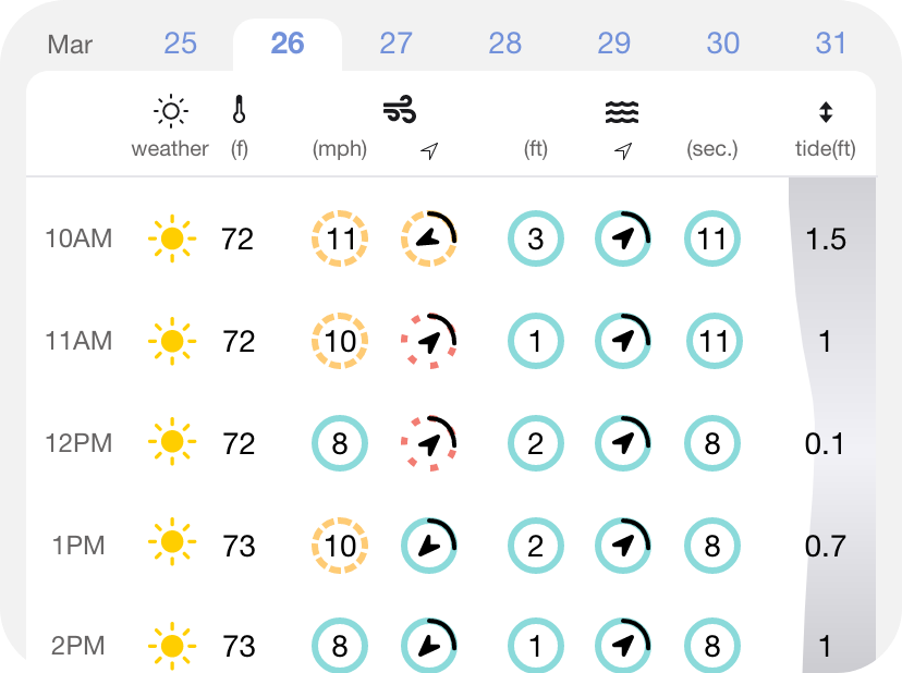
Instead of using various color schemes indicating different weather conditions, I categorized weather conditions into only 3 stages with color circle guides. For color blinded surfers, I added different types of borders to the circle guides—circle, dashed circle, and dotted circle. Colors function only as an additional identifier.

REFINING THE DESIGN
Style Guide

DELIVERING THE SOLUTION
Vela

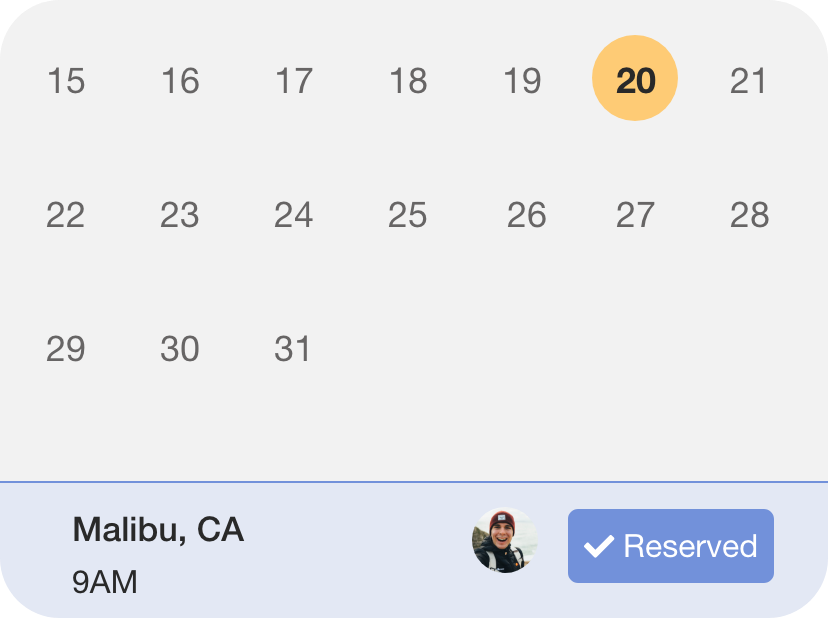
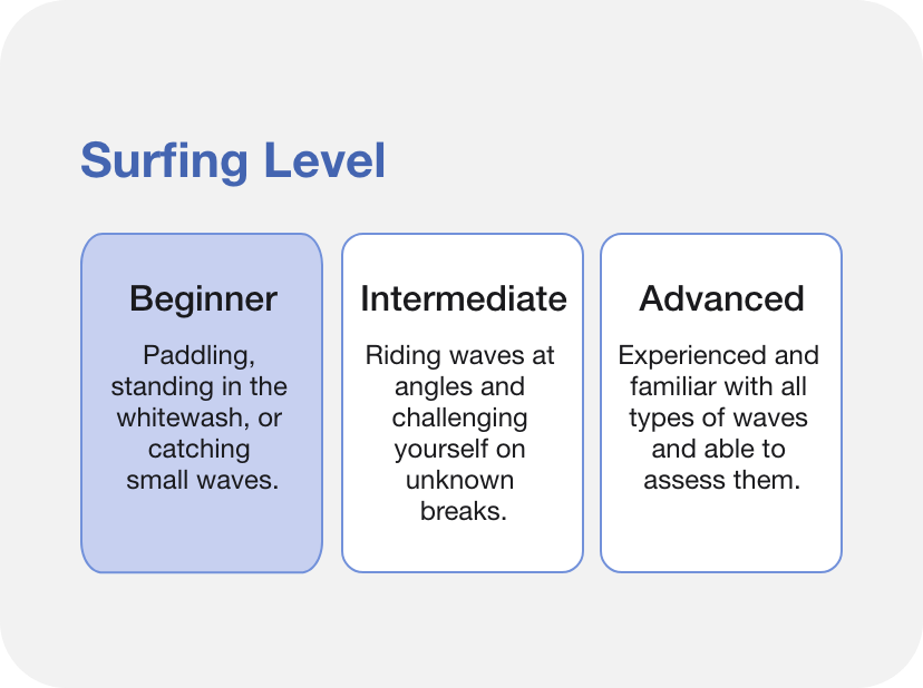
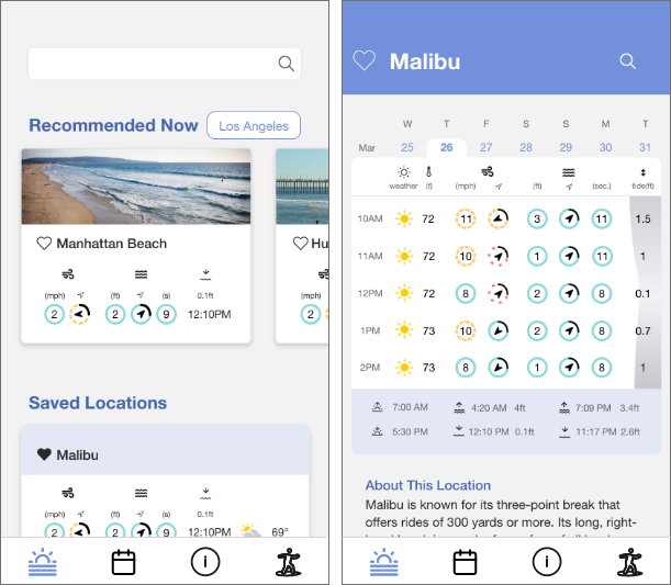
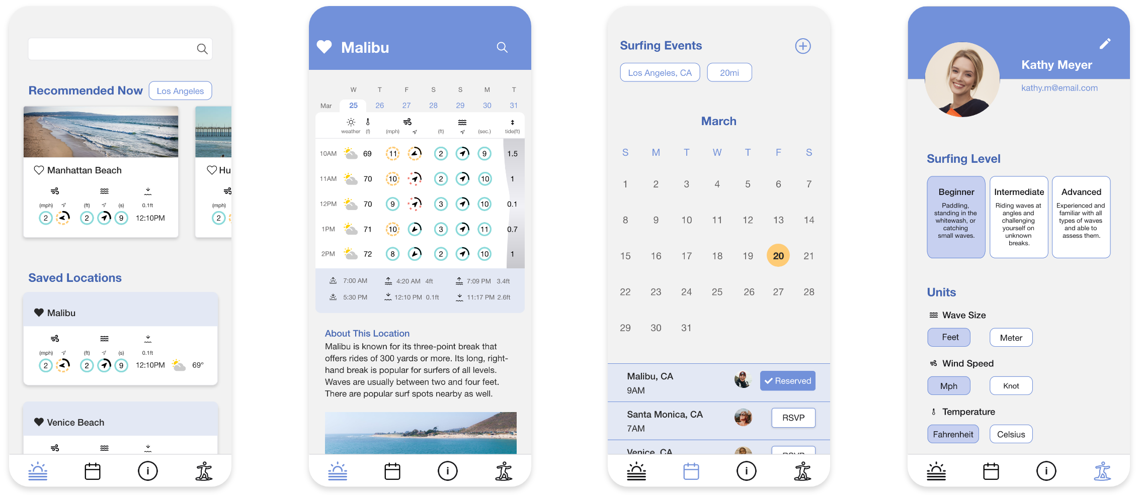
This is Vela. Vela provides easy-to-understand surf forecast data with circle guides for beginner and intermediate levels, and an events calendar for users to connect to surfing communities.

Level Based Guides

Vela informs which data  are suitable for the users.

Easy-to-interpret
Circle Guides

Circle Guides shows whether data are ideal for the user.

Events Calendar to connect to communities

Calendar shows groups meeting on the desired dates and locations. 

Try Vela
Watch Vela Tutorial

Next Step

The goal of the 1st phase was to provide an easy to understand forecast for beginner and intermediate levels.
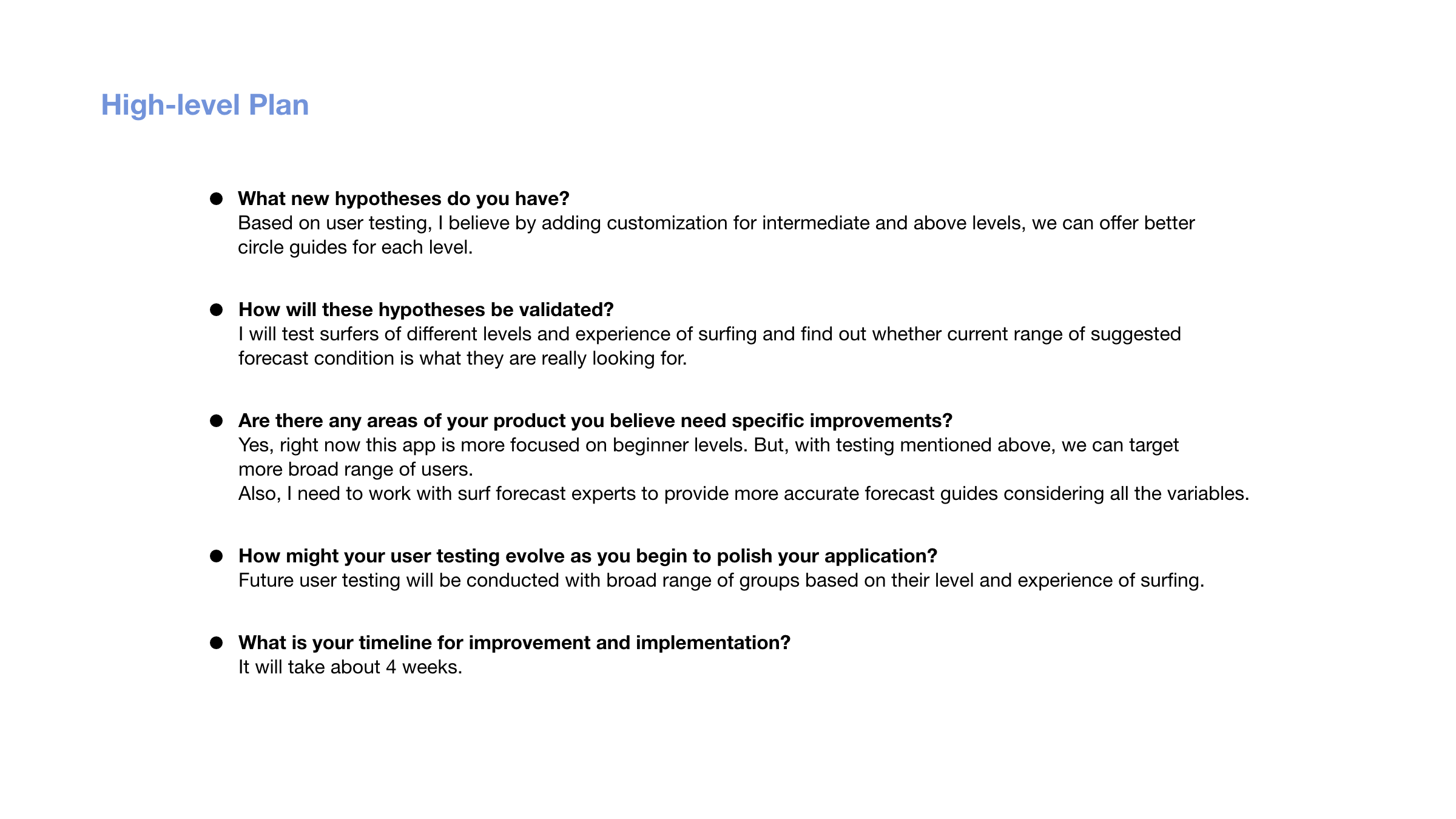
For the 2nd phase, I will test whether intermediate and above levels have different standards for optimal surf forecast conditions and whether they would appreciate customization for current circle guides.
Credit

Photo by Shifaaz Shamoon on Unsplash

Privacy Settings
We use cookies to enhance your experience while using our website. If you are using our Services via a browser you can restrict, block or remove cookies through your web browser settings. We also use content and scripts from third parties that may use tracking technologies. You can selectively provide your consent below to allow such third party embeds. For complete information about the cookies we use, data we collect and how we process them, please check our Privacy Policy
Youtube
Consent to display content from Youtube
Vimeo
Consent to display content from Vimeo
Google Maps
Consent to display content from Google